CORNELL BIRDING APPS
Improving UX for Cornell Lab's Citizen Ornithology apps
Improving UX for Cornell Lab's Citizen Ornithology apps
Overview
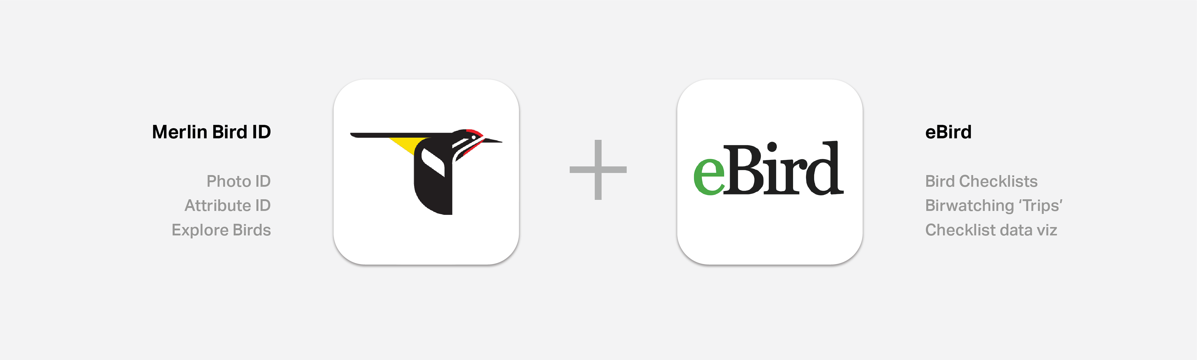
This project improves two birdwatching apps. Merlin Bird ID is an app that allows users to Identify birds. eBird is an app that allows uses to log sightings for citizen science. I noticed, as a user of both, that this pair of apps could be combined to improve user experience. After reading some reviews, I realized that I was not alone in this thought. I had been wanting to try a mobile UX project, so I ventured out on a project to understand and optimize the experience of these apps.
Client
Personal Project
Tools
Invision Studio
Role
UX / UI Designer
DESIGN PROCESS
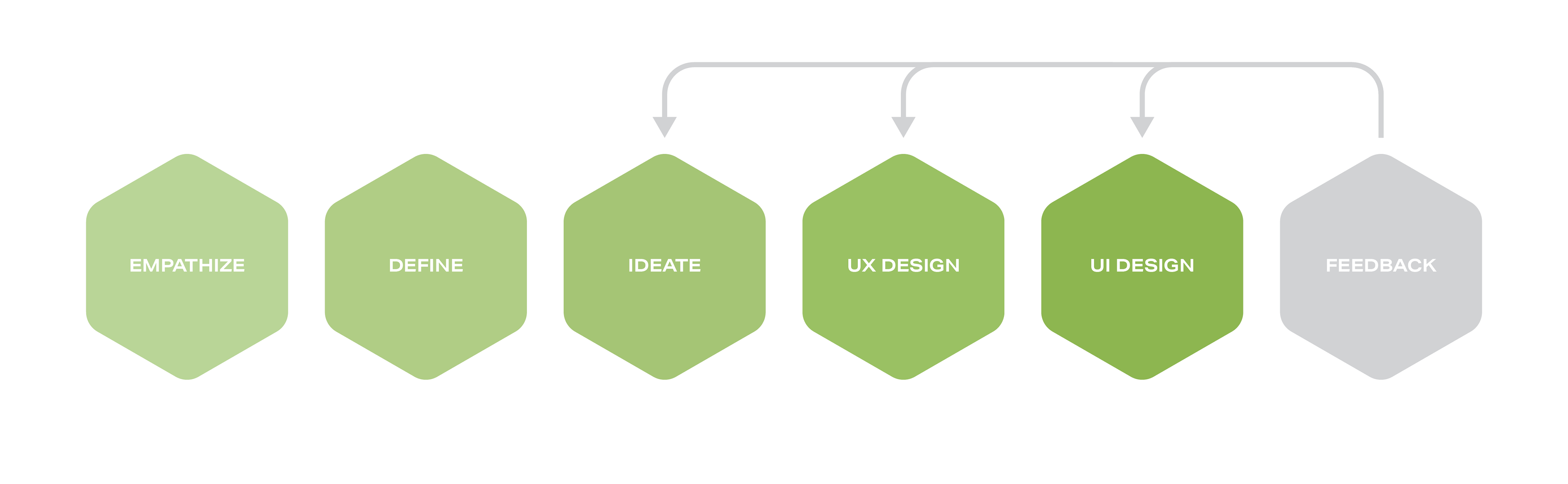
EMPATHIZE
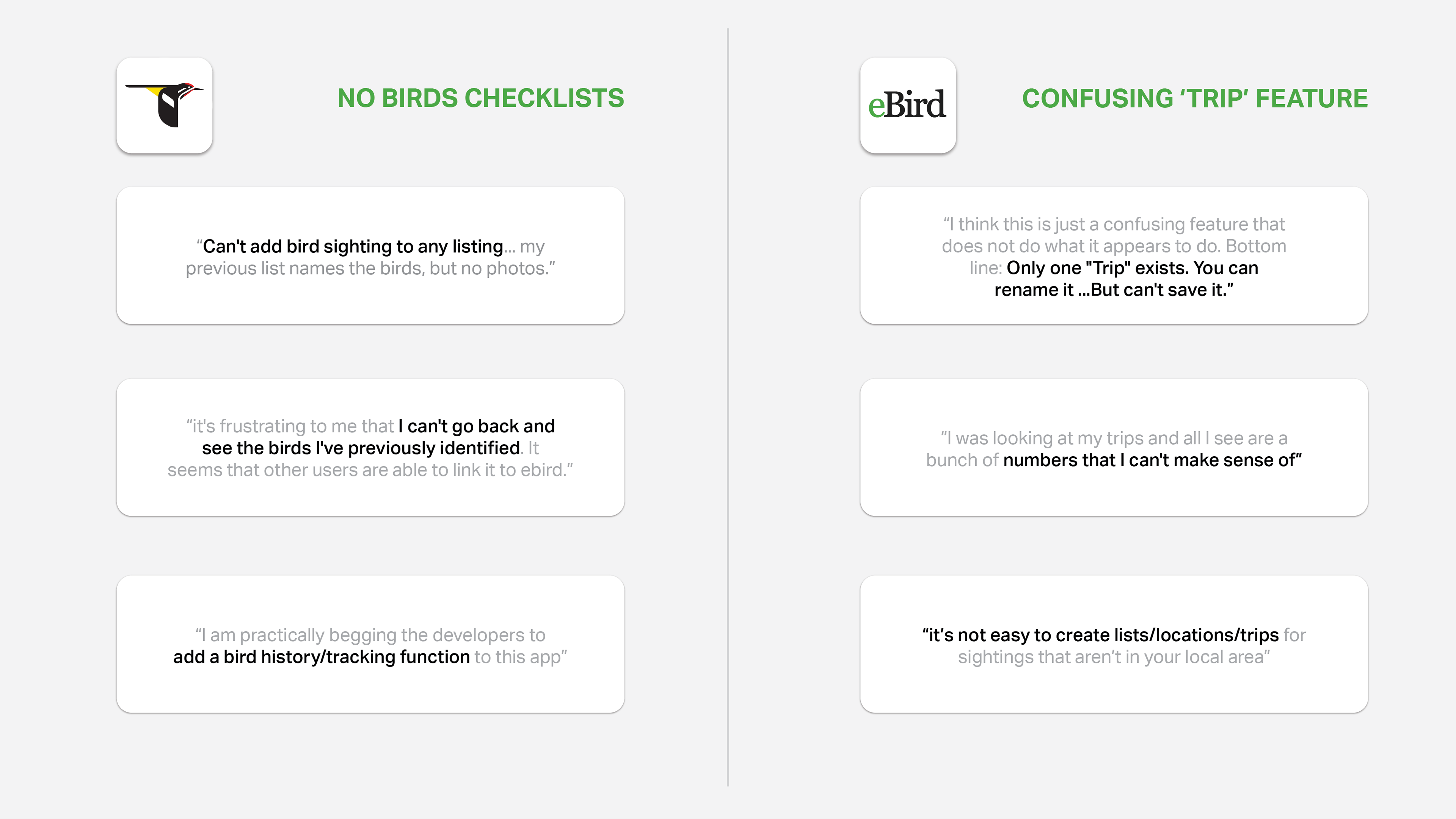
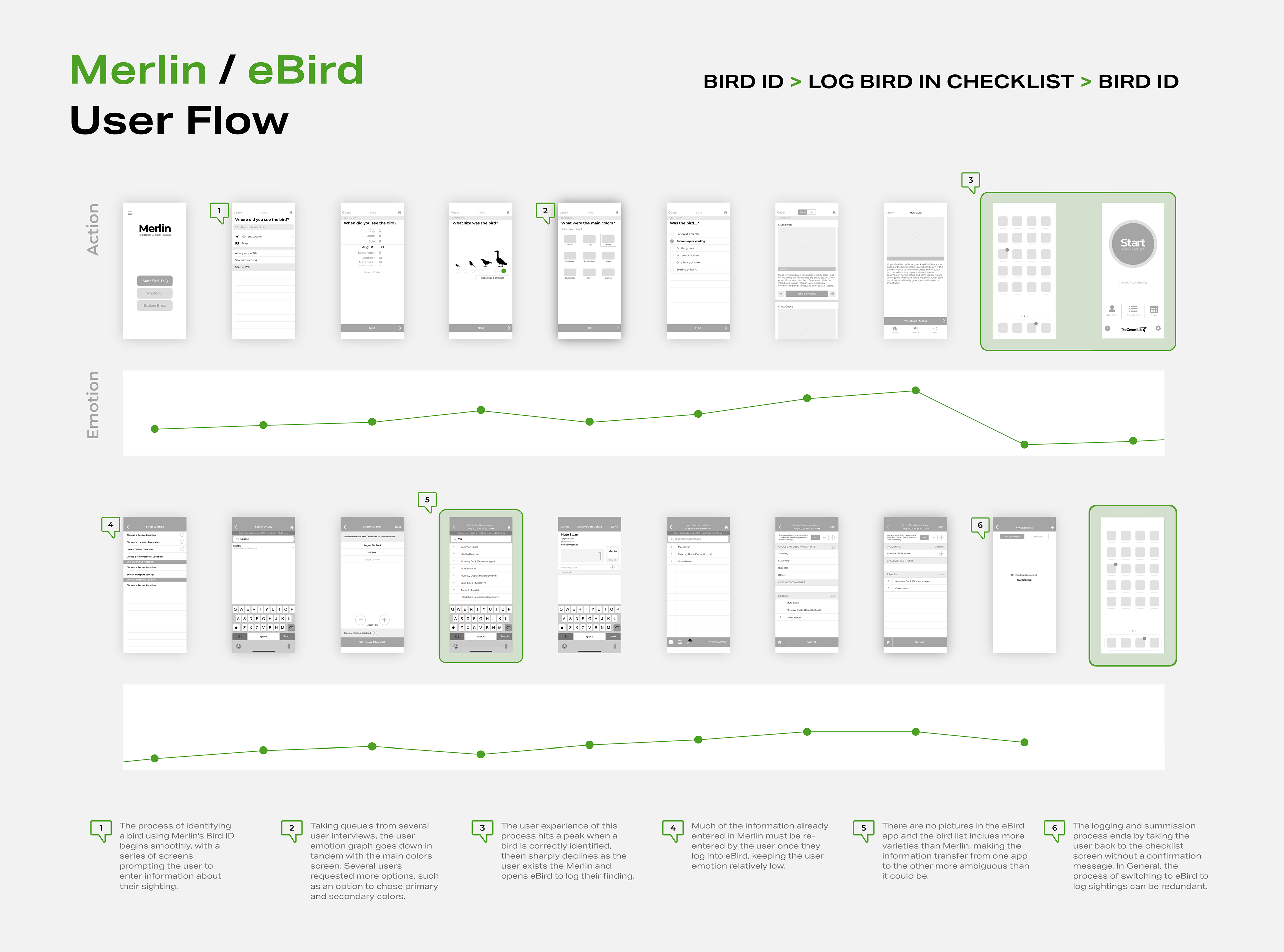
Review Analysis
Reviews can be largely broken up into two main pieces: feedback relating to the fact that there's no way to save the birds you've Identified in Merlin, and that relating to the eBird 'Trip' feature, a way to organize your logs, being confusing.
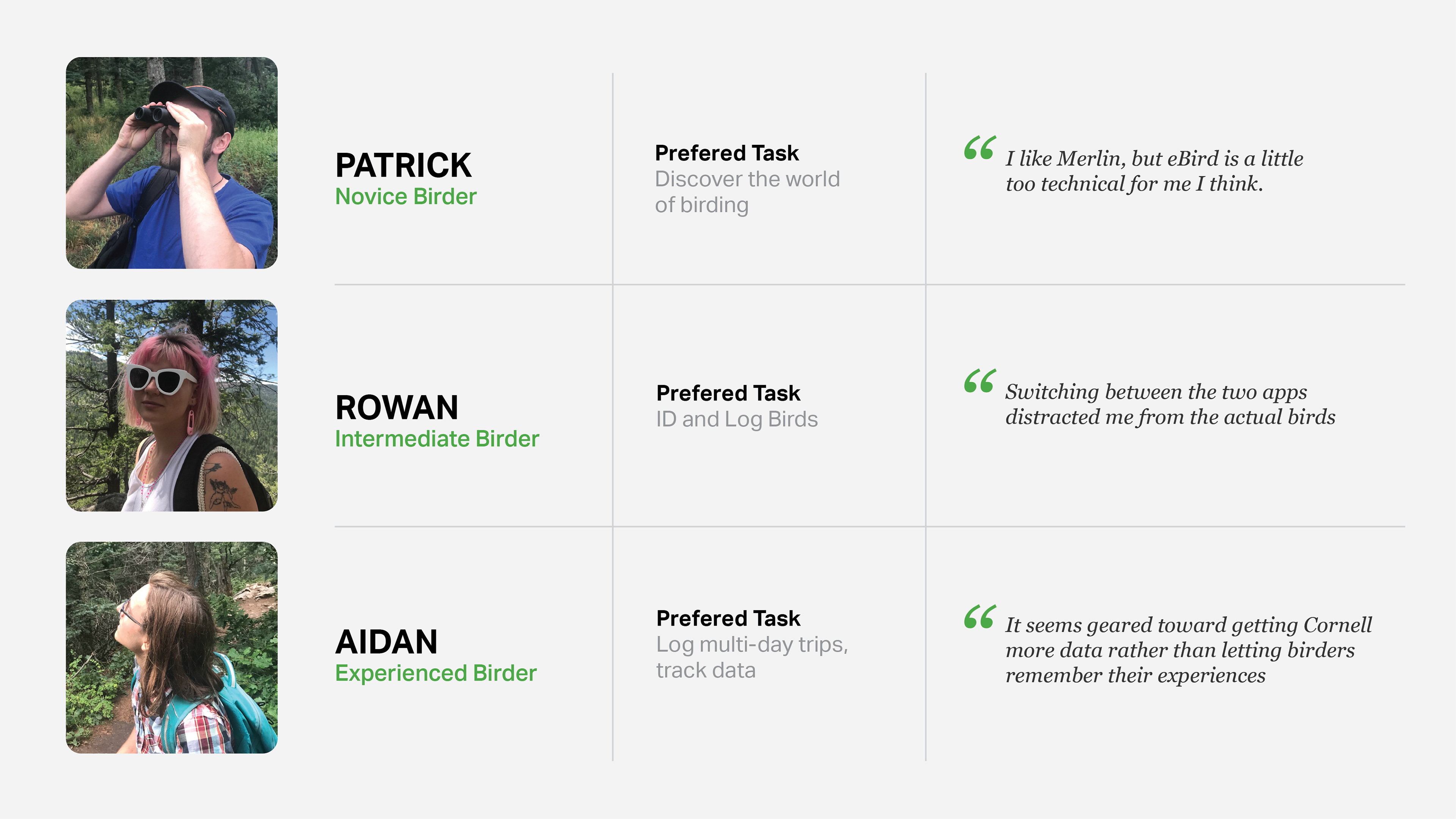
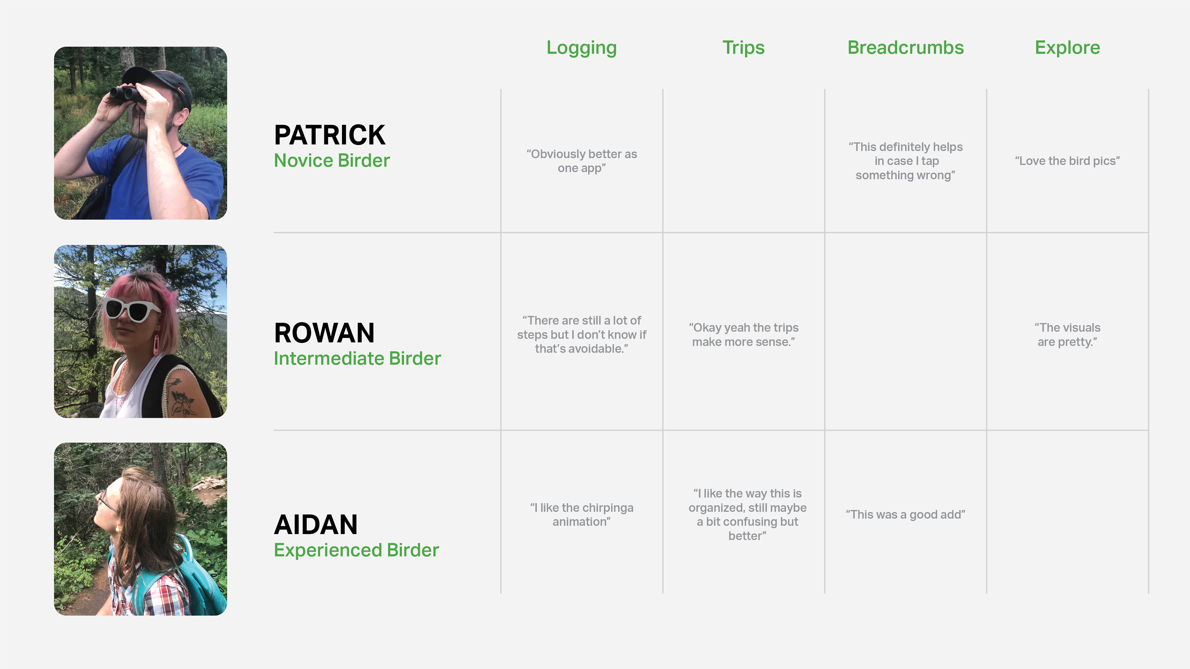
Field Tests and Interviews
I went birdwatching with three friends each with a different level of birdwatching expertise. I had each of them download the app and use it on our trip. Afterwards, I interviewed them asking about their experience. I picked out the most relevant quotes below.
DEFINE
Value Proposition

Simplifying Touchpoints
The Cornell Lab provides two apps for features that many users want in one app. The process of Identifying and logging birds could be completed in many fewer steps.
Organizing Logs
Many birders go on multi-day trips, so providing a way to track and save their checklists in groups would allow them to organize sightings and memories.
Elevating the Interface
Using these tools should be an elevating experience that reflects what it's like to experience these animals in nature.
IDEATE
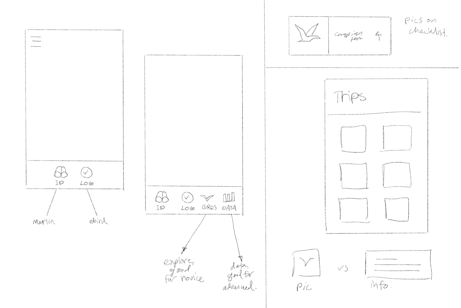
Sketches
Some sketches of interface configurations. I considered a couple different bottom bars with different features surfaces.
UX DESIGN
Combining the Apps
Highlighted problem screens can be removed if the apps are combined, representing a significant jump in experience
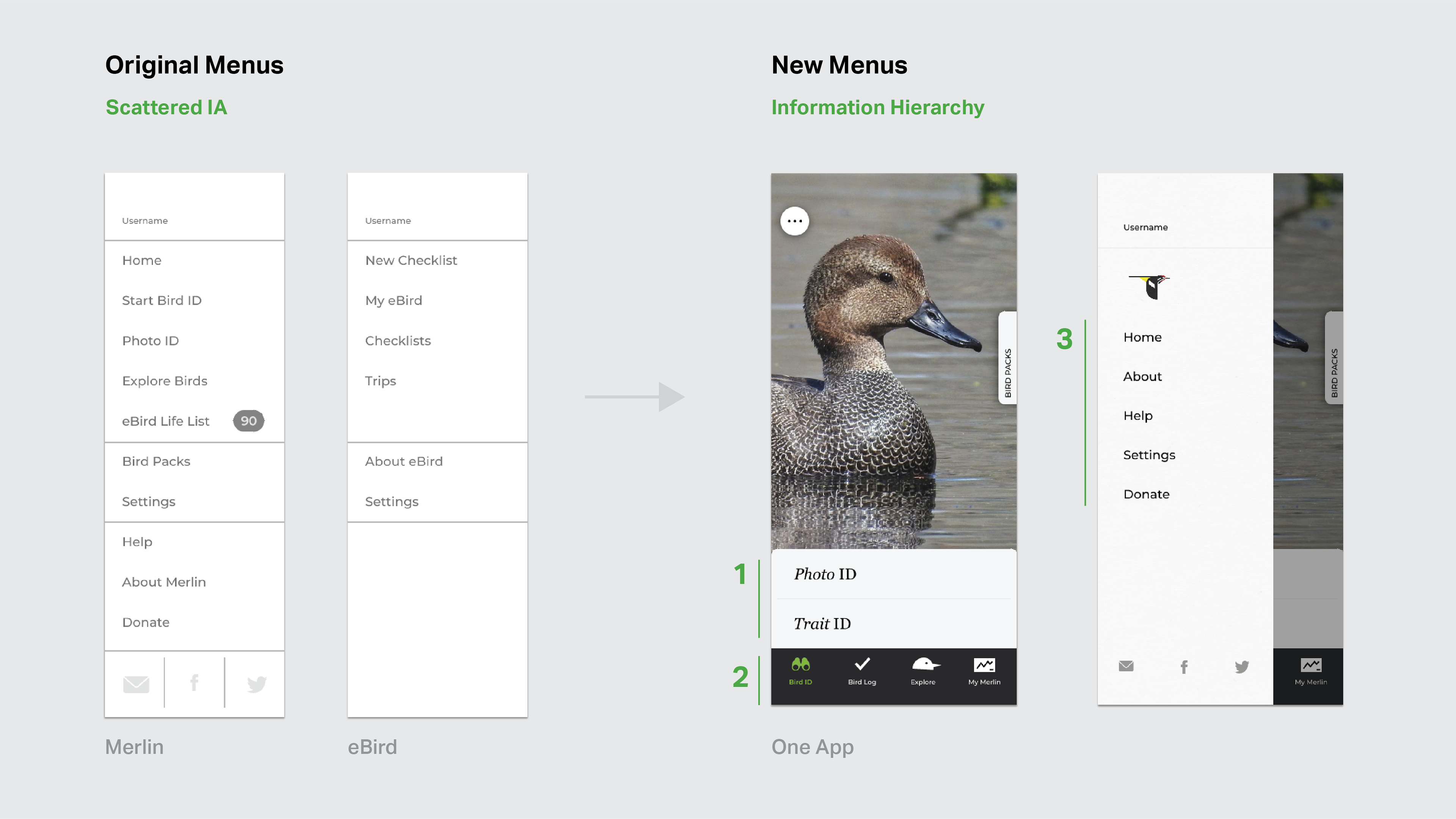
Menu System
Information hierarchy was added to the menu system, reflecting the interests of users, with features catering to each user type in the bottom bar. This persistent bar also adds more mobility throughout the app.
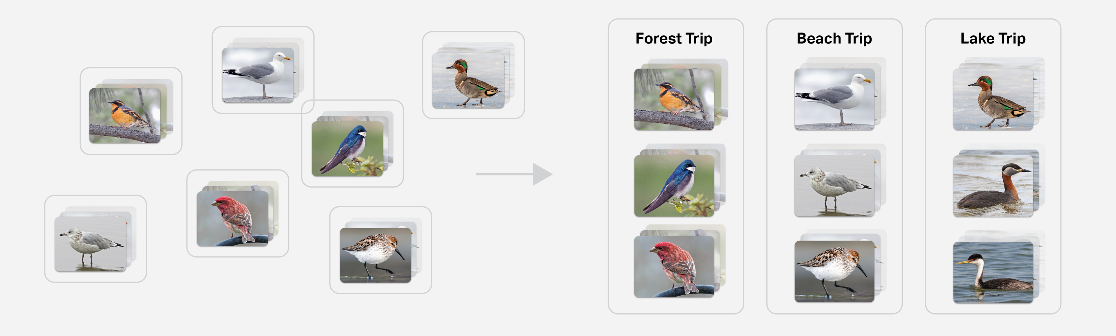
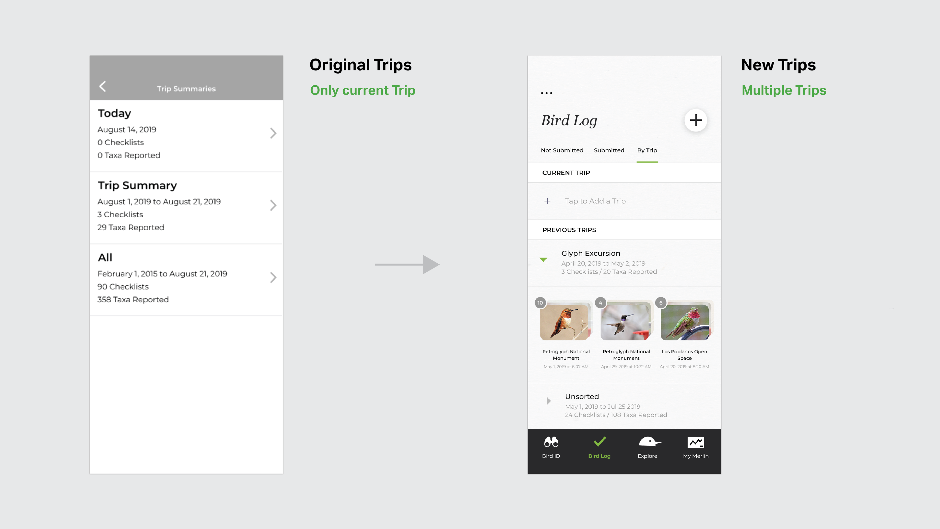
Checklists and Trips
Trips were given a new interface that allows users to have more than one folder, and shows a visual of the birds in each checklist. The new design ads more organization that allows users to track and remember their birding experiences.
UI Design
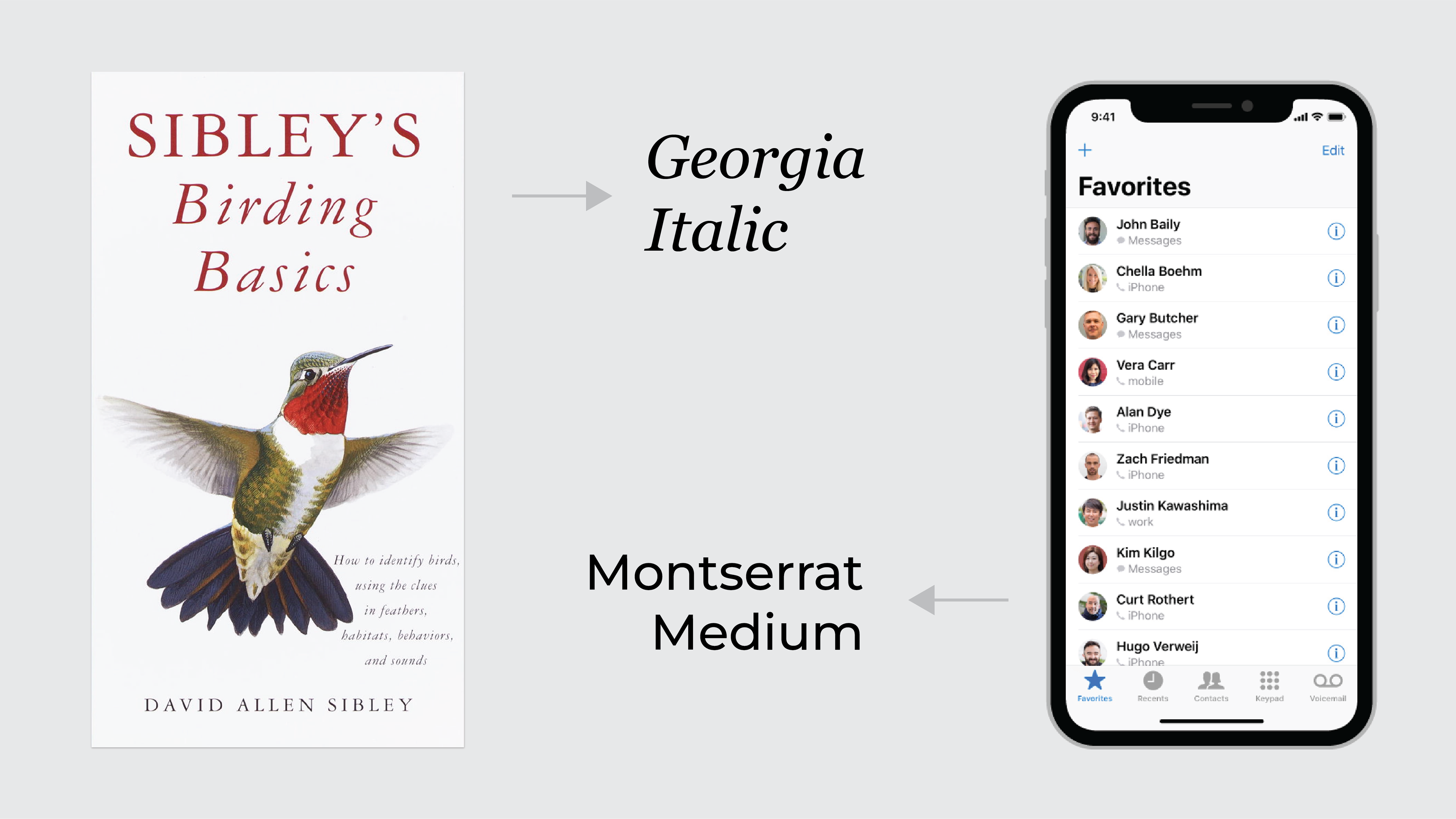
Typography
The typography for the project takes inspiration from classic birding guides, combined with clean minimalist mobile design.
Design System
I created a design system using the same brief from the typography: make something that combines the texture of classic bird guides with the usability of modern app design.
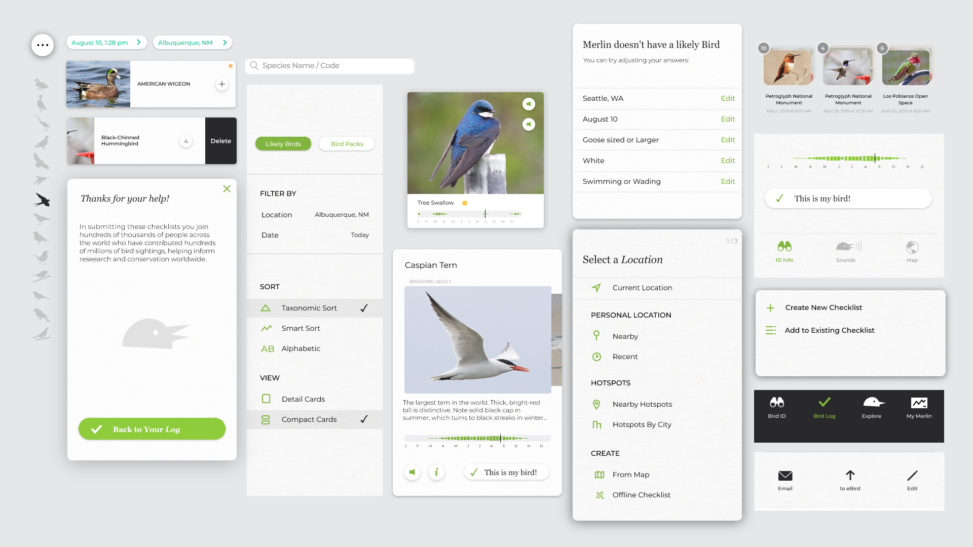
UI Improvements
UI improvements for more visual and reflect the experience of reading a bird guide or that of going birding itself.
Breadcrumb System
Breadcrumb system increases ability to edit Bird ID results without starting over.
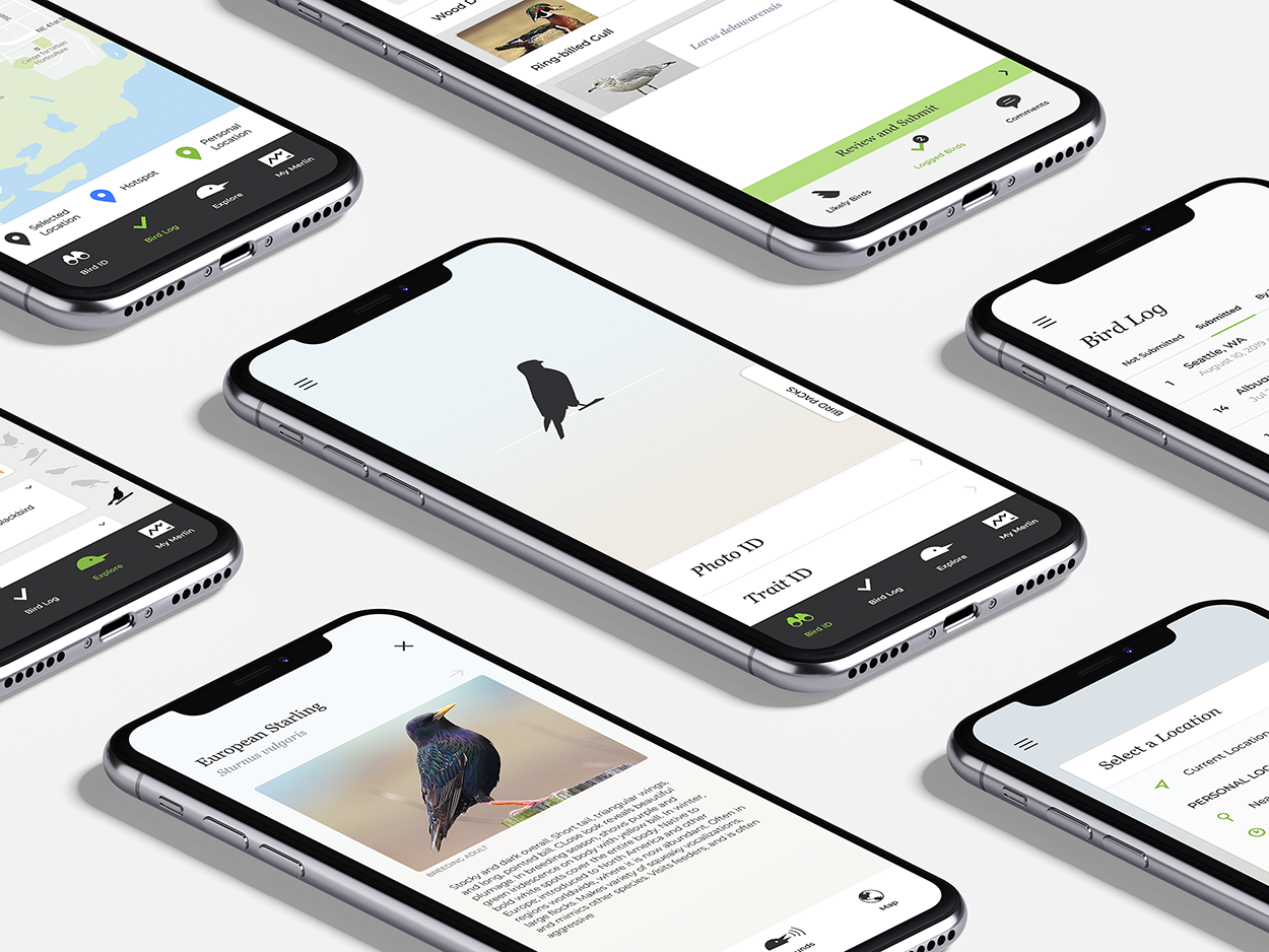
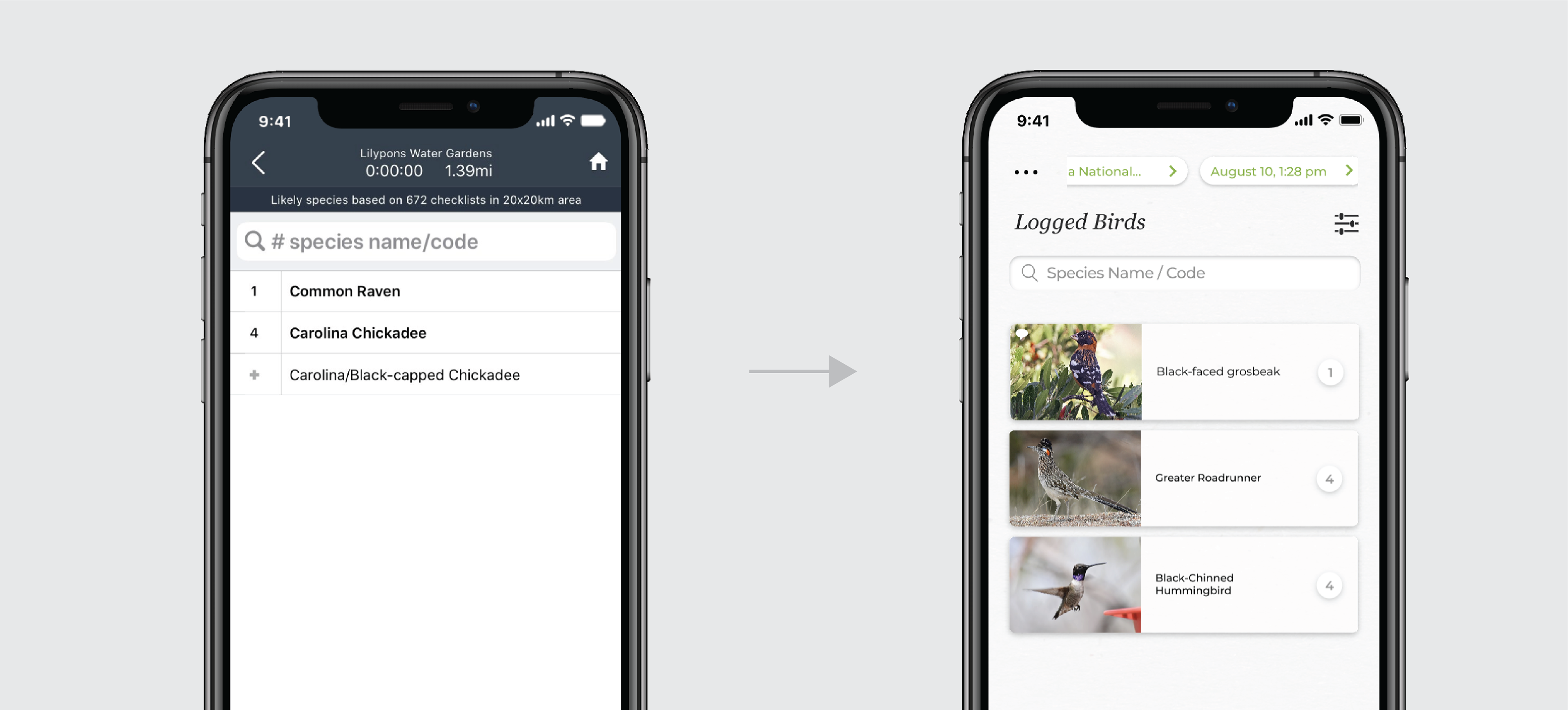
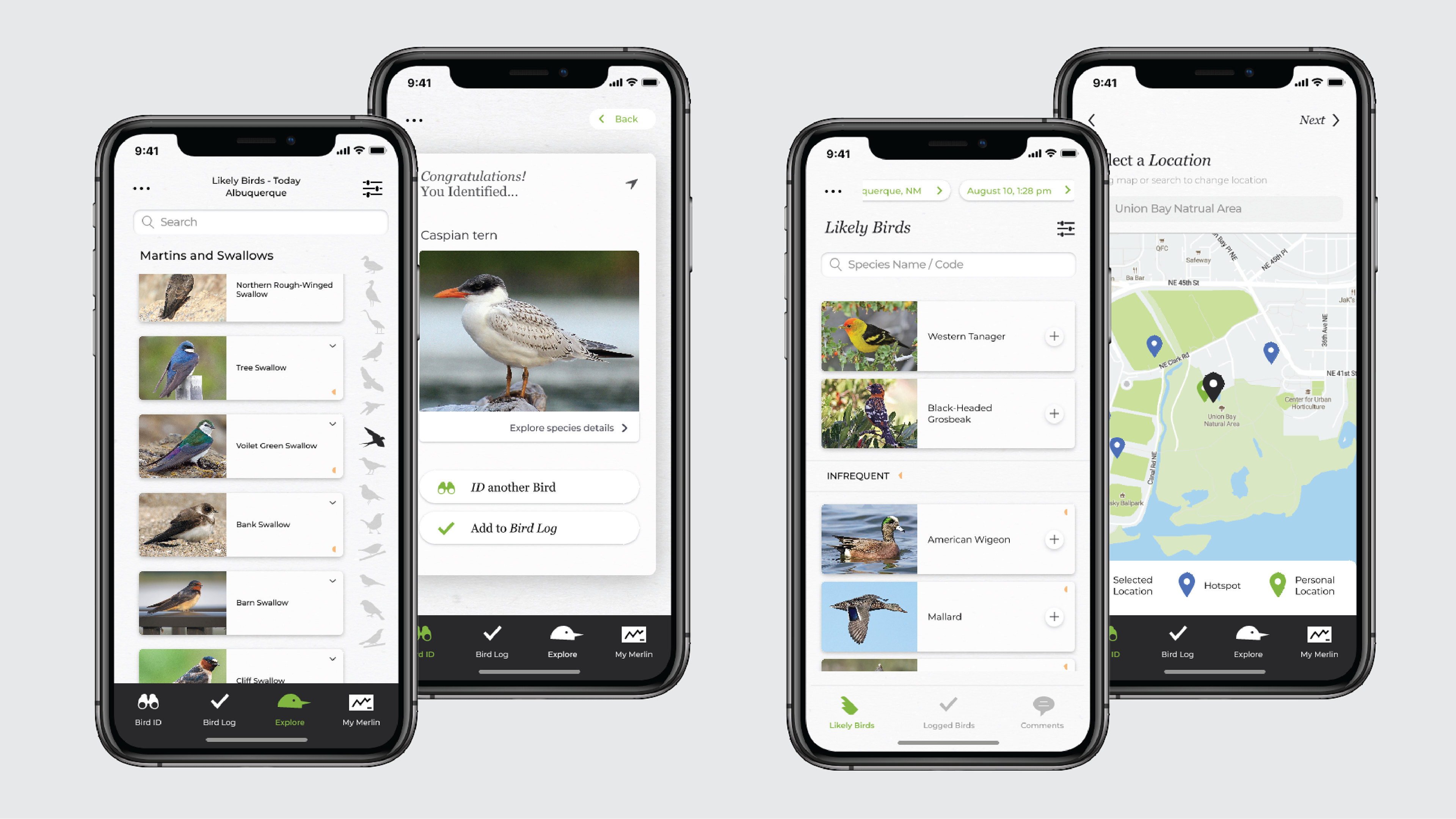
Identifying a bird and adding it to a checklist
Now that the two apps combined, the process of adding a bird is much easier.
Creating a new checklist
New checklist flow with added visuals
FEEDBACK
Improvements Tracked
I circled back with The three individuals I interviewed and asked them to interact with clickable prototypes, saying out loud anything they felt was notable.
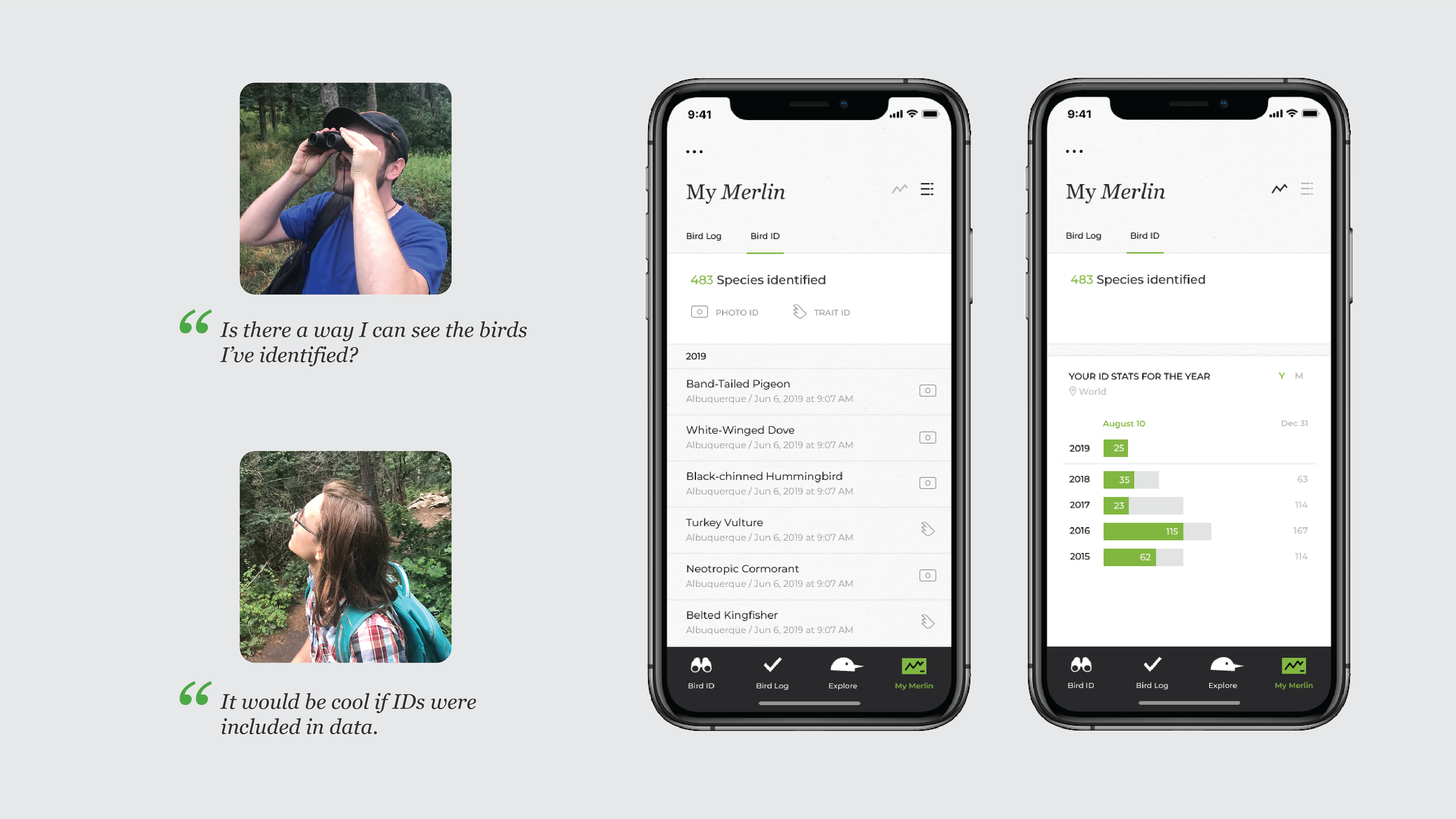
Tracking Birds You've Identified
I decided to design two of the pieces of feedback that pertained to keeping track of bird data
NEXT STEPS
Next steps on this project, were it to have continued, would include responding to some other pieces of feedback, including addressing slight confusion on the trip feature and potentially simplifying logging steps. This would probably require speaking with the scientists to see which parts of the data are essential.