ELECTRIC POWER FAST
Visualizing the power Grid for Argonne National Lab
Visualizing the power Grid for Argonne National Lab
Overview
Electric Power Fast is a data dashboard created to visualize US power grid data in the event of significant grid disruption. Our team at RS21 connected with engineers at Argonne national Lab to improve their method of visualizing their data, which was not producing the insights it could. My role on this project was to team up with data scientists at our company and engineers at Argonne to understand the data, and make it Intuitive. I also provided UX and UI on the dashboard.
Client
RS21 for Argonne National Lab
Tools
Sketch
Role
UI / UX Designer
DESIGN PROCESS
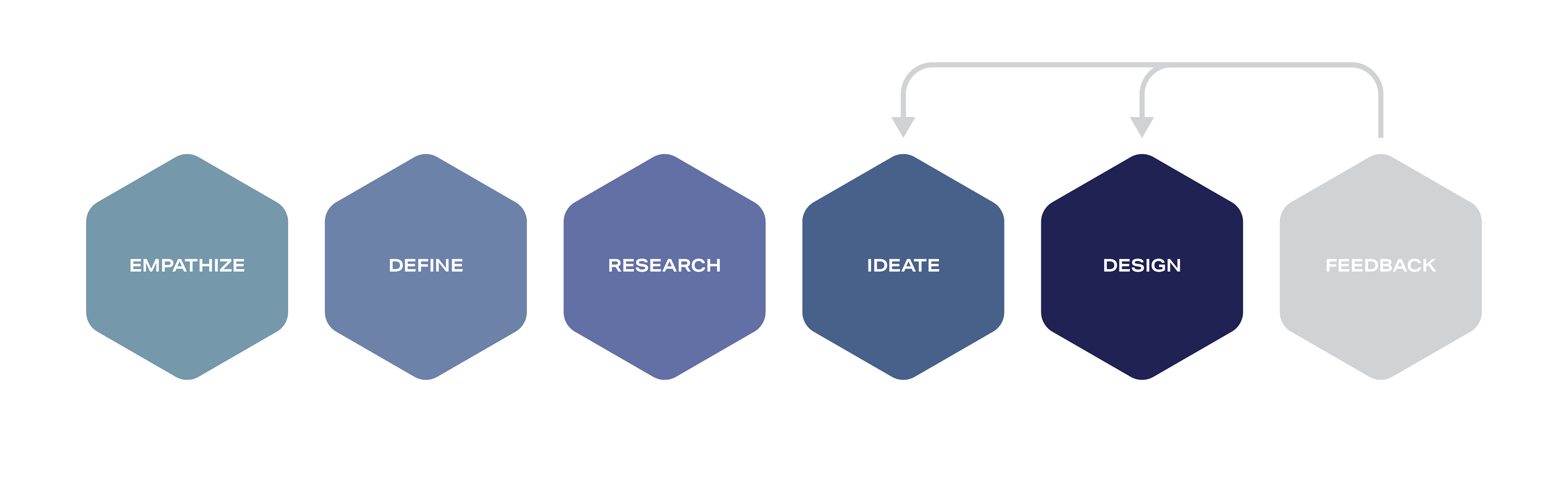
EMPATHIZE
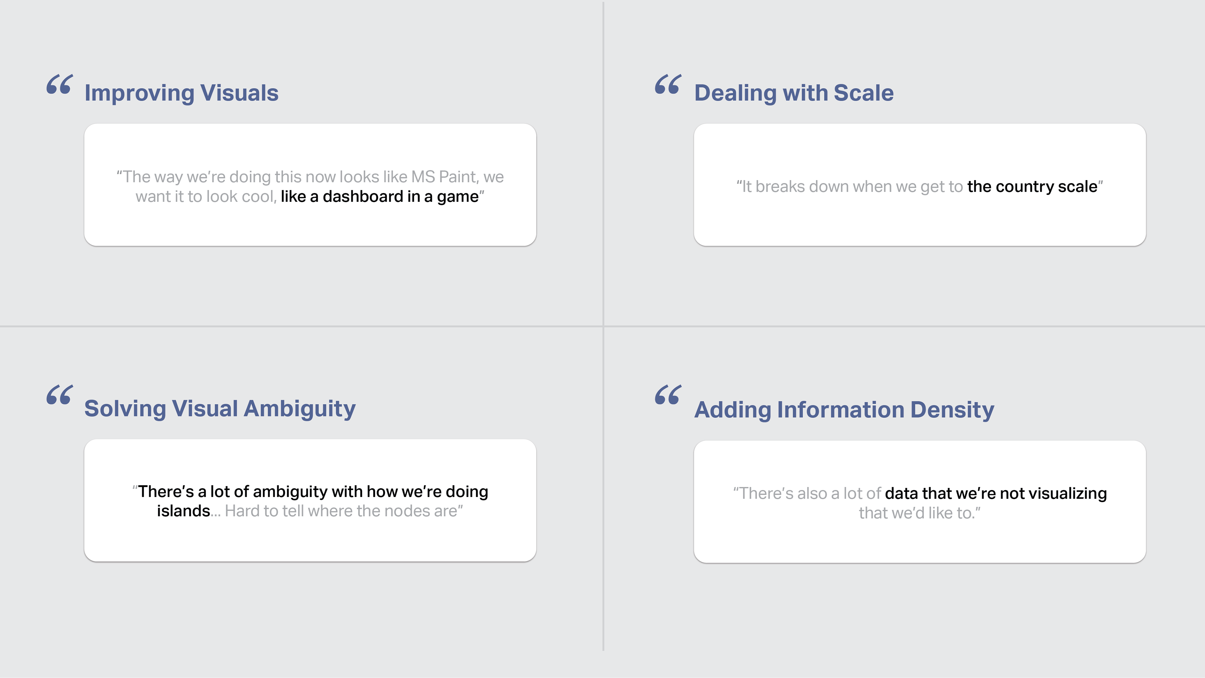
Interviews
I conducted interviews with members of the Argonne engineering team to understand the problem. I've selected some choice quotes from the engineers below.
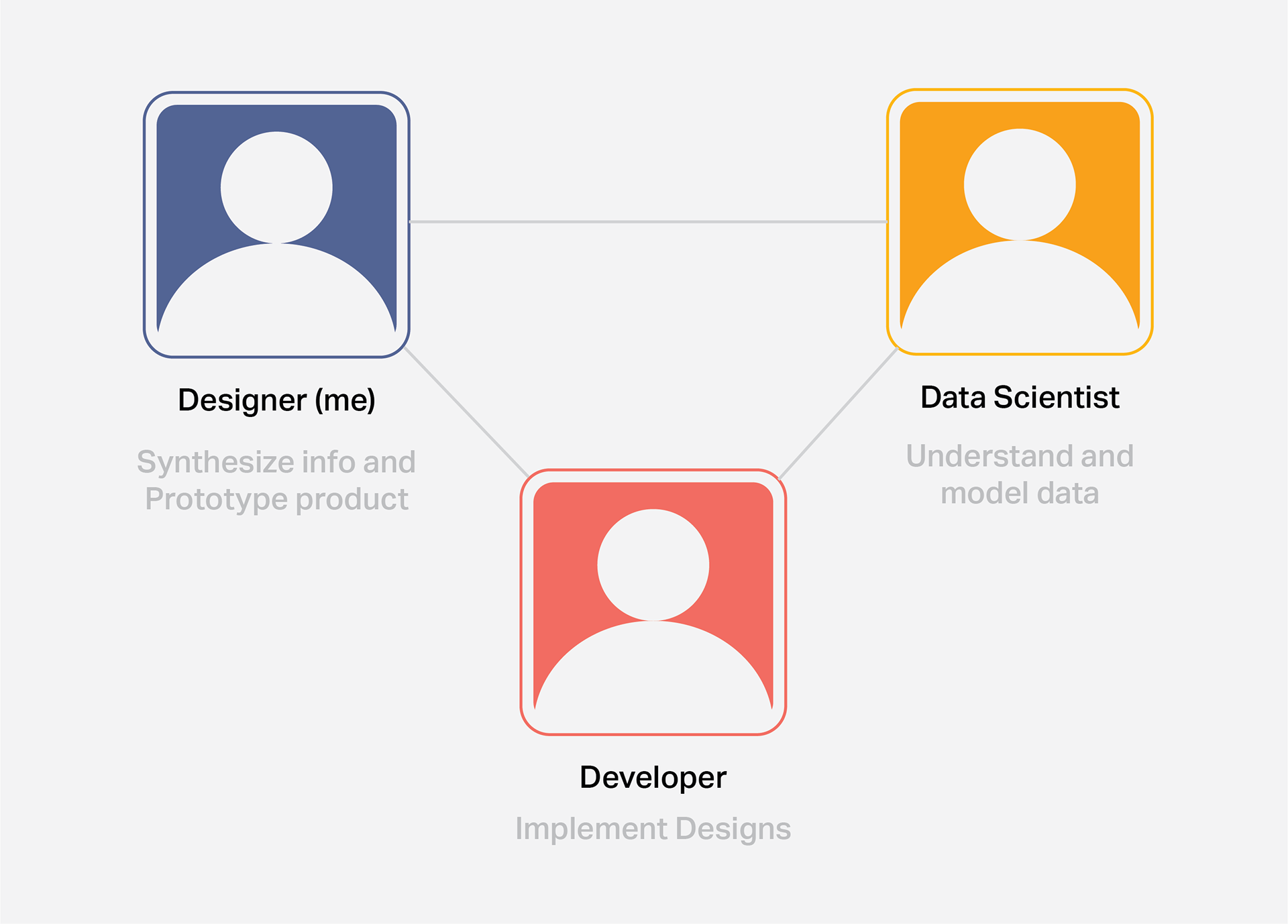
Working with a Team
I worked with a data scientist and front-end developer to understand the data and execute the designs.
DEFINE
Value Proposition

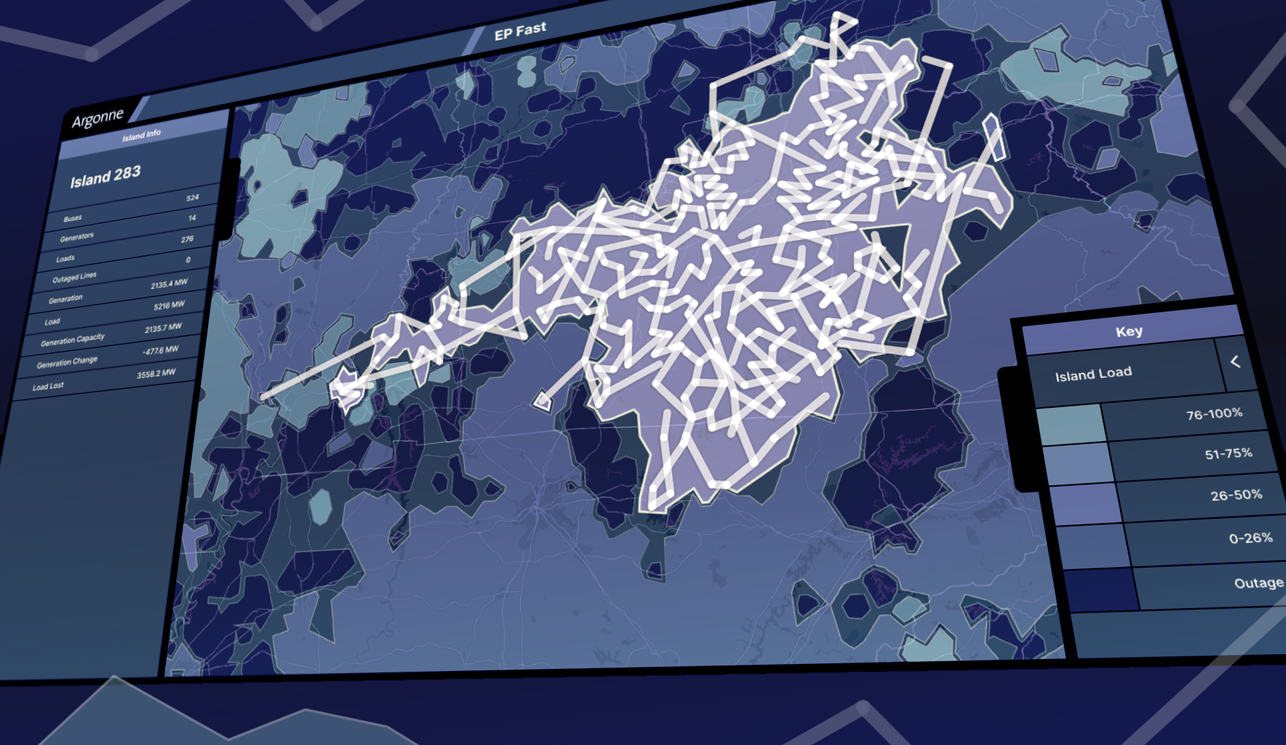
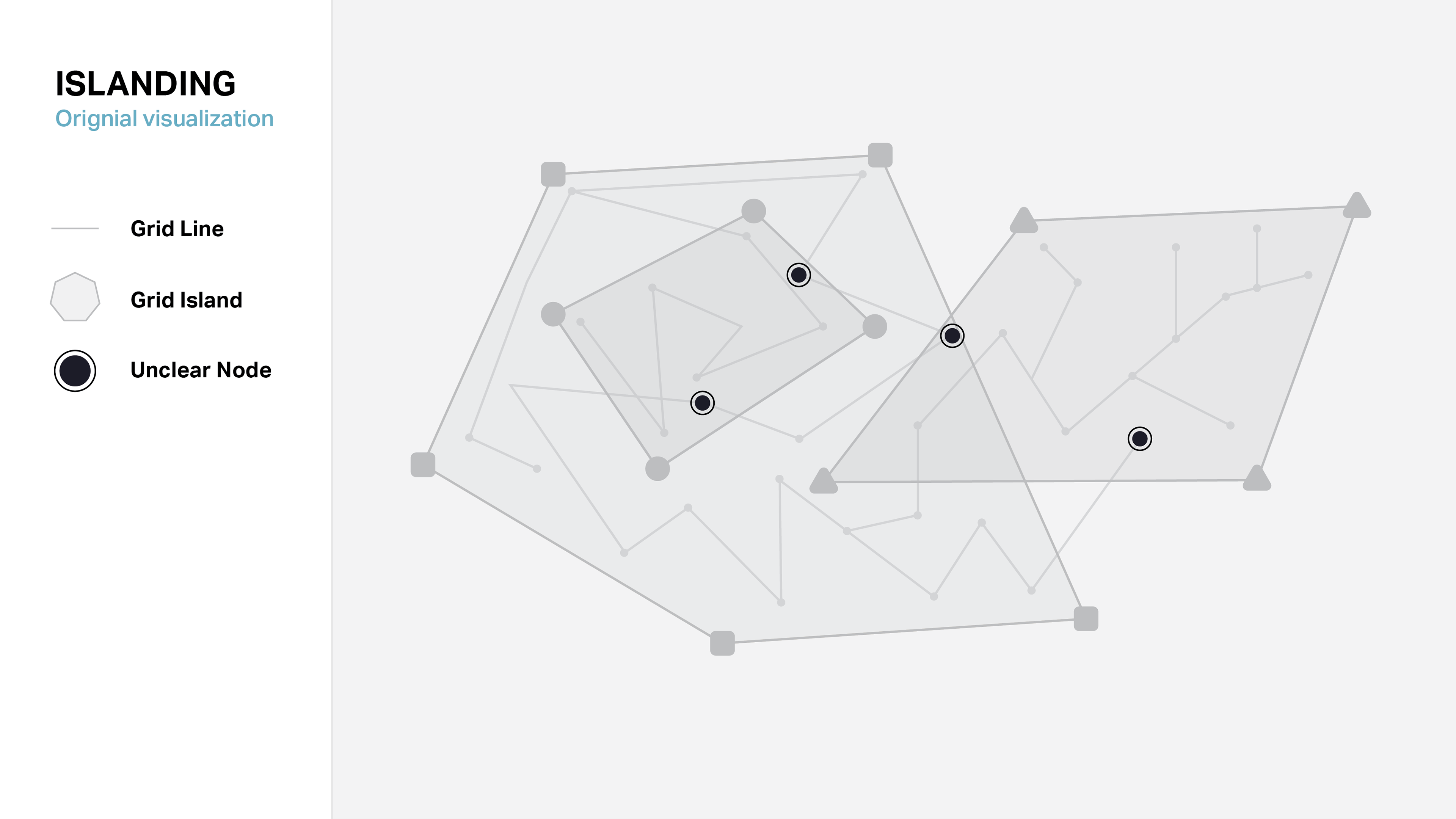
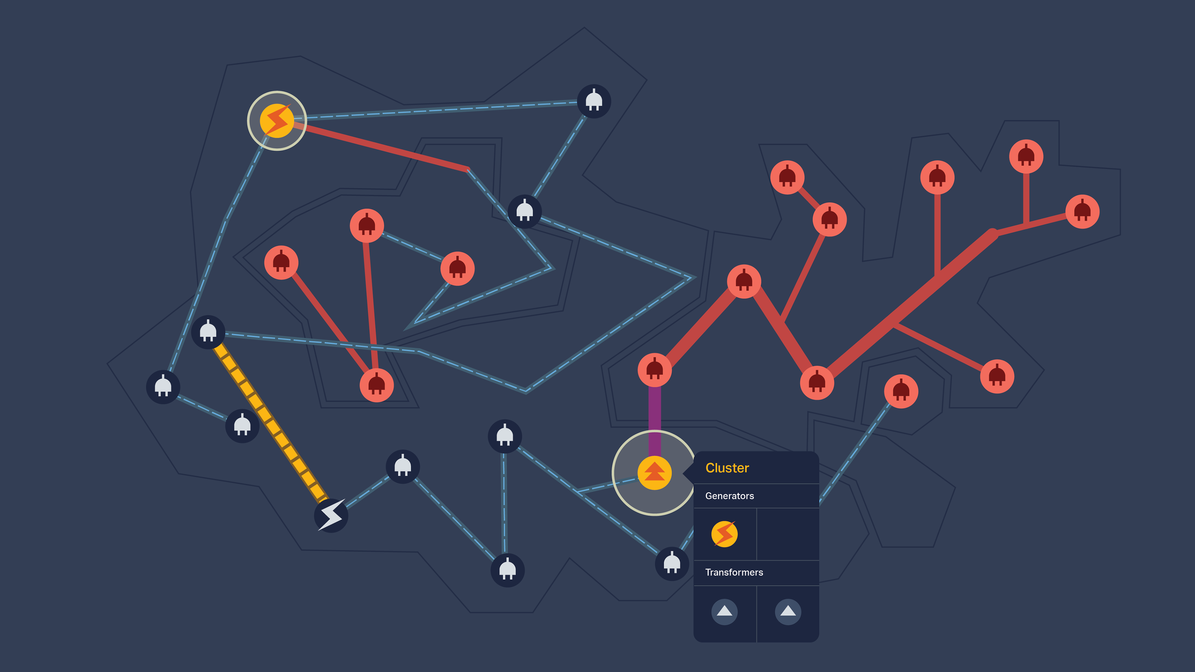
Islanding: a Visualization Puzzle
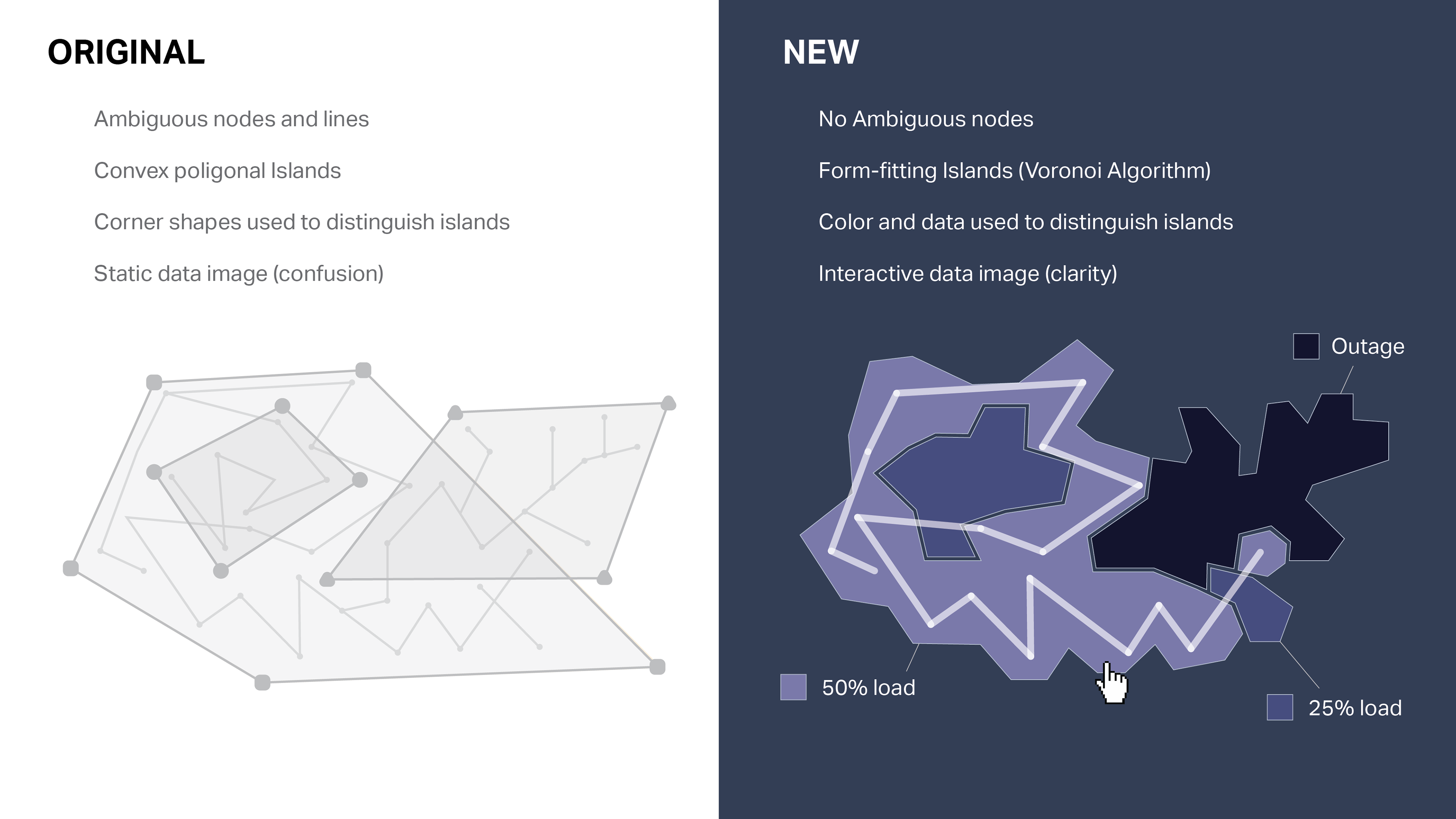
An Island is a section of the grid from or to which power cannot flow. Islands form when the grid is disrupted, and detecting them is critical to getting the grid back online. An island is composed of lines and nodes. Even at this small scale, this original visualization creates ambiguity as to which island contains which nodes. This only becomes a bigger problem as the data scales to include the whole US grid with its thousands of nodes and lines.
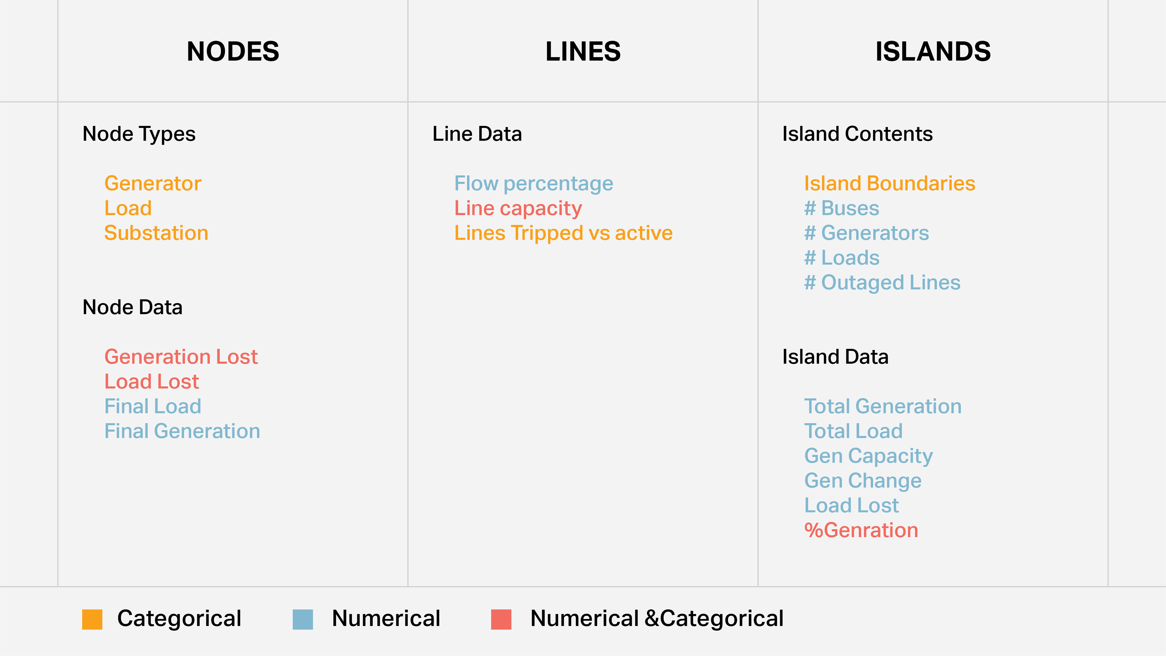
What needs to be Visualized?
The engineers gave us CSV data of the following, which we were tasked with visualizing in a geospatial form.
RESEARCH
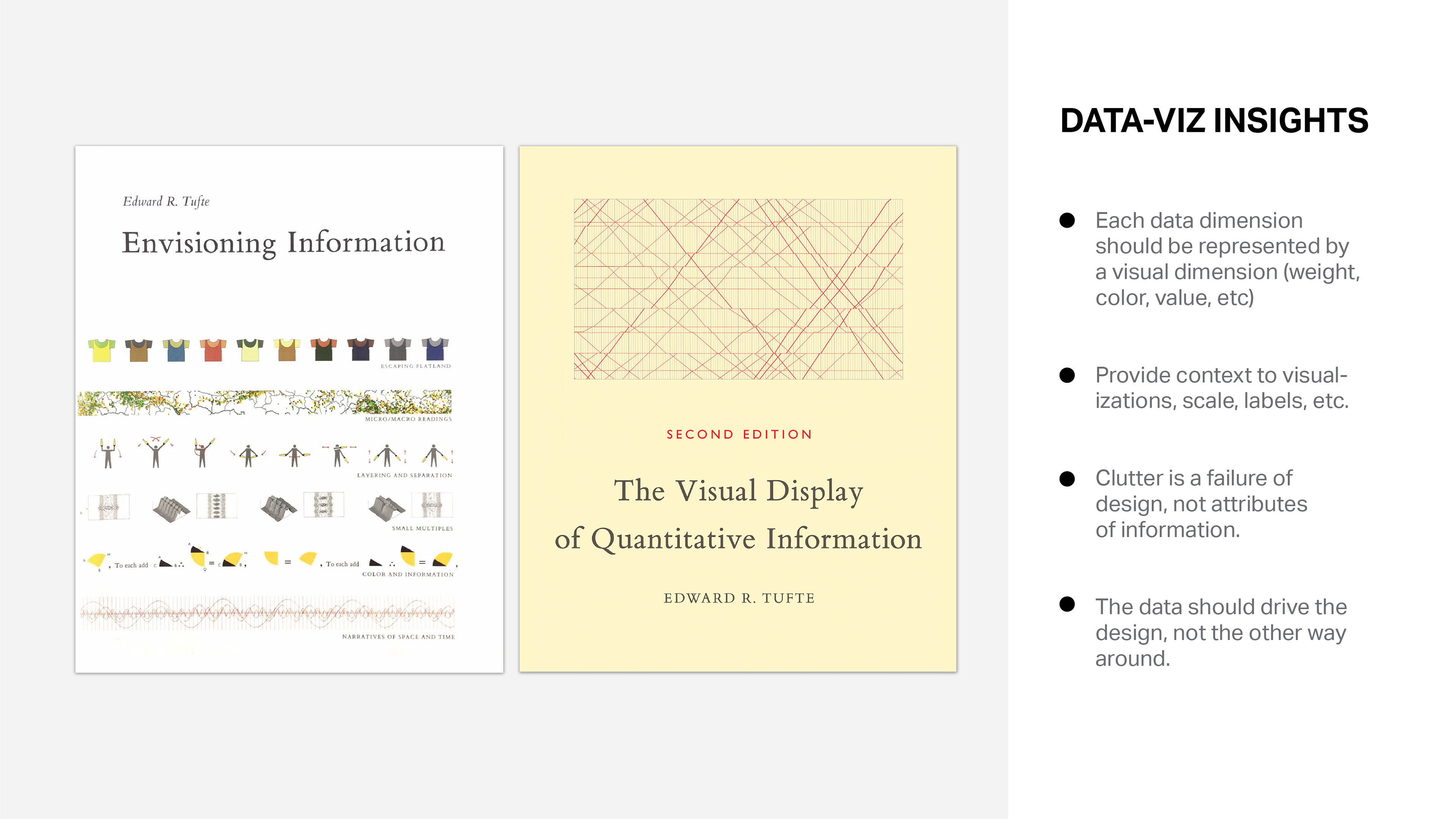
Reading Tufte
I read two books on data visualization to better understand the problem.
Understanding the Grid
IDEATE
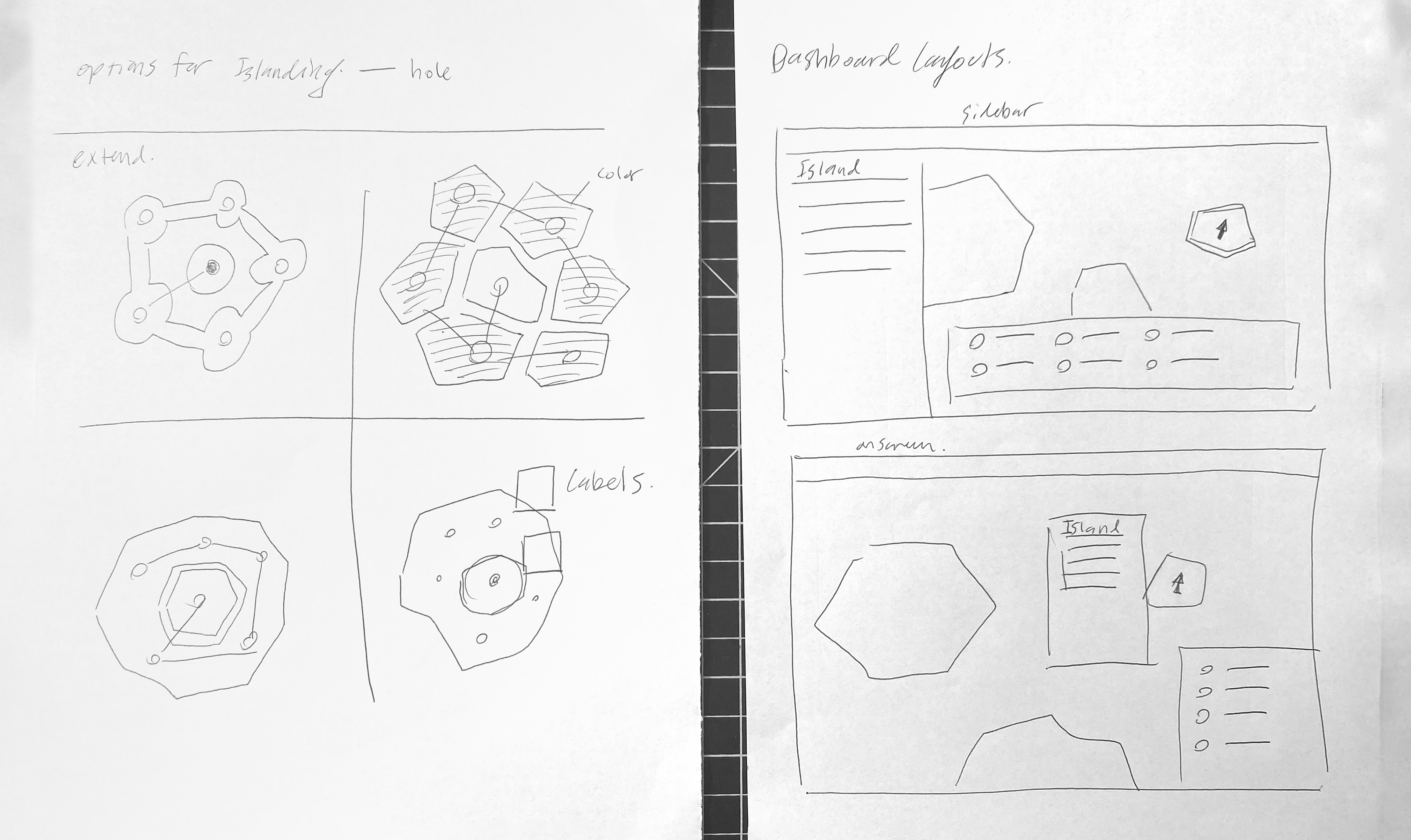
Sketches
Ideation for islanding involved exploring options for bounding the islands given different ambiguous cases. Shown below is a case where a single unconnected node is in the middle of a set of connect ones. Also shown is a sketch exploring menu placement.
DESIGN
Islanding Breakthrough
I worked with the team developer to come up with a visualization solution that involves using a Voronoi algorithm to closely envelop nodes, and using an interaction to clarify ambiguous nodes and lines.
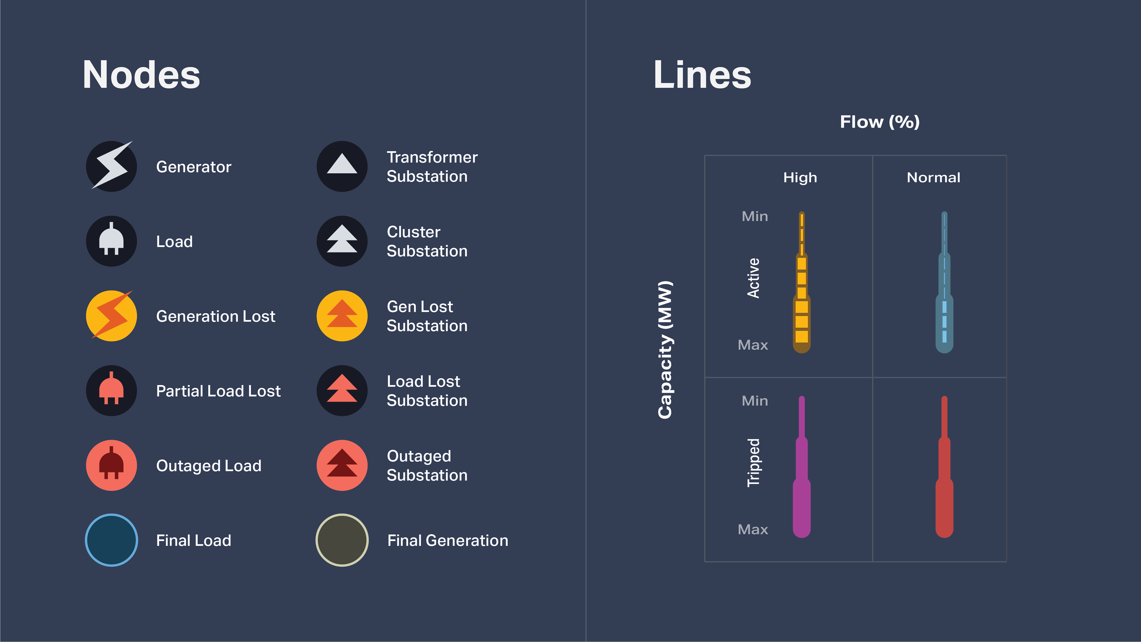
Nodes / Lines
I designed a visual system for types of nodes and lines aligning with data specifications. The generation lost nodes are brighter because those are more important for the engineers to see. This kind of visualization can be turned on and off depending on what needs to be visualized. Given the complexity of the data, we opted for very simple icons.
DEMOS
Islanding
Users can click to see outlines of various grid islands
Nodes
Users can click Cluster nodes to get more information
Lines
Lines show the directional flow of energy
Scale
When zooming out, the visualization turns into a heat map showing node density
FEEDBACK
Implementation Issues
There were some issues with implementing the designs, particularly with different screen sizes. In response to this I decided to learn how to code responsive HTML and CSS in order to communicate how to implement designs more effectively.
Narrativizing Designs
One piece of feedback from this project is that the dashboard loads with all the data showing at once. This was overwhelming for some during demos. We should have loaded the dashboard with the islanding visualization alone, and perhaps dropped in some tool tips to guide users to additional layers.